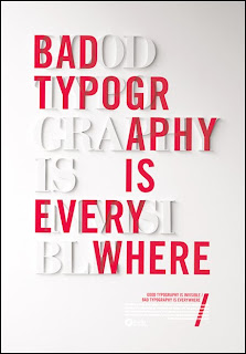
Good Example

This is an example of good type because of how evenly everything is spaced and spread out. Everything is layed out using grids and has a very legible and organized hierarchy. Its also ironic to me what it is because of the fact that im using the image for a comparison between good and bad type. It says "Bad Type Is Everywhere" and behind it in white it says "Good Type Is Invisible". The font used is also very clean and easy to read.
Bad Example
Okay, so this is obviously just annoying to look at right off the bat. "Twenty20 Summer" is in a really overly grungy font and with the sunset in the background it just gives me a headache looking at it. The next "font" or whatever that is, is completely illegible. If you're trying to say something on an ad you want the type to be readable. I honestly have no clue what that says. All the placements of the fonts are scattered and there's absolutely no sense of hierarchy what so ever. This altogether is just a completely crappy ad.
